Sunday, May 20, 2012

Me, Myself & I

In this assignment, instead of choosing specific memories from my early childhood, elementary school and middle school, I choose to look at it a different way. Most of my photos reflect more of a perspective than a specific memory, of being an especially short child, and having to look up at everything. The other photos show things that were in my childhood, that I gradually became interested in, or the first time I did something.

Early Childhood:


Elementary School: 


Middle School: 


Thursday, April 26, 2012

Team Photo Journal

-Eliza-
The inspiration for this photo came from the Eliza's series that dealt with playing with light, shadows and contrast. She also takes photos from unique angles, so instead of the generic full face photo, I took it from a heightened angle. 

-Grace-
Grace works a lot with fashion photography, so I tried to take this photo so it would have that happy feeling to it. She tends to make her photos pop so I boosted the contrast, and made dramatic shadows, also keeping it in color.

-Zephy-
Unfortunately, the effect that Zephy used the most with her photography (neon) is no longer available so I combined a couple effects on a new editing site to try to reinvent neon. I also added different colors, because her photos are usually in color. 


-Zaina-
Nearly all of Zaina's images are in black and white and have a sense of mystery. I tried to recreate that feeling, adding black and white, and the little window in the top left corner slightly blurry I hope adds some sense of mystery. 

-Sam-
The inspiration for this photo came from Sam's past photos filled with vibrant colors and lots of flowers. For this photo I tried to show his exuberance and his love for color and flowers.  
-Aubrey-
Aubrey's photos are very unique in the way that he approaches them. For this photo I choose make it black and white, like many of his photos, and have a sort of double exposure that he uses. I couldn't do it on photoshop, so instead I used an effect online, that isn't exactly the same but it is similar. 

-Cassie-
Since Cassie plays around a lot with changing the color of images and using various effects, I tried to find interesting effects but still have the photo have a fun feeling because her photos usually portray that. 

-Khalena-
I took and edited this photo this way because Khalena's photos usually have color, contrast and text. So for this image, I added her name, and slightly changed the background color to match her style. 

-Nora-
Nora's photos most always have interesting colors, and taken in a unique way. Since I couldn't get a landscape photo with her, I tried to take the photo at a different angle, and then added contrasting colors. 
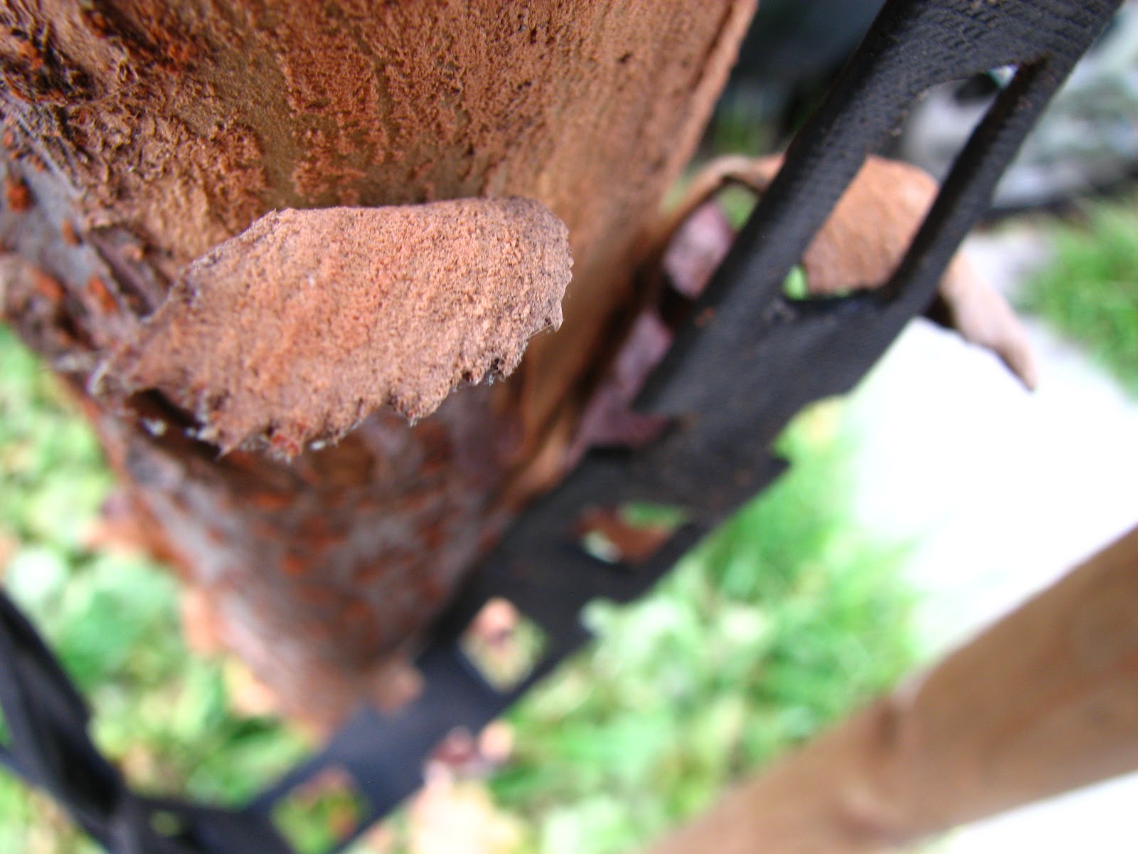
-Renna-
The inspiration for this photo came from a collaboration of different series that she has done with texture and fashion photography. I made it the image black and white but kept the texture in color. 

Thursday, March 29, 2012

Song Interpretation

Moonlight Sonata 
This instrumental piece by Beethoven, has an eerie sound. It does not have much to it besides piano, but reminds me of a rainy day, desperately wishing to go outside. It is not particularly a happy song, but the song makes me think of motion, or someone dancing. It is comforting, yet slightly depressing at the same time. The first photo is of the rain on the window, not edited to show the rawness of the photo. The second image is showing the motion that I image someone would be seeing if they were dancing, or spinning around. The last image I felt concludes the story portrayed in the song by combining the two previous photographs together as the song comes to an end. 


Monday, March 12, 2012

Individual Photo Project: Abstracts

With these photos I tried to create a field of mystery within the photo but still being able to tell what the photos are of. Some of these are shadows, and some of them are more abstract shapes.


Sunday, February 12, 2012

Experimental Sketchbook

This project that we worked on deal with editing more than actually taking photos. I used picnik for all of the edited images. I tried to use a bunch of different effects, learning about new ones that I hadn't used before. 
                                                                             Before

After
 For this photo, it was two photos of the Apple brand logo but in a connecting diptych. In picnik, I used boost first, then I used "gritty". After those two effects, I used vibrance and dots and dots (the CMY Halftone adjustment) and finally cross process. 
Before

After
The first effect I used in this photo was cross process. Then I used circle splash (the screen adjustment) that made have more depth. The last effect I used was duo-tone with dark blue and pale yellow. 
Before

After
For this photo, the first effect I used was invert. Then I added boost, and duo-tone. For the duo-tone effect the two colors I used were black and white. I finally added adjustable threshold for the finishing touch.
 Before

 After
In this photo, I used dots and dots (circle dreams adjustment) first. Then I used focal zoom and duo-tone after. For duo-tone I used purple and yellow, then adding cross process. Finally I added heat map (the thermal adjustment) which makes the colors pop.  
 Before

After
The first effect I used on this picture was invert which created a cool contrast and the texture on the shape. Then I used duo-tone with blue and purple, finally I added posterize to give it a slight edge. 
Before

After
For this photo, I used HDR-ish first and then neon. For neon, I used blue. After that, I added dots and dots (circle dreams adjustment, then difference adjustment) and for a final touch, vibrance. 
Before

After
In this picture, I used cross process first, and then duo-tone (purple and yellow). The final effect I used was goofy, which added the swirly effect of the image.